

What Makes a Good Landing Page: Proven Strategies for Conversion Success
Why Landing Pages Matter
Ever clicked on an ad, expecting something awesome, only to land on a confusing, slow-loading mess that made you click away faster than a cat startled by a cucumber? Yeah, we’ve all been there.
That frustrating experience highlights one critical question: what makes a good landing page?
If you’re running ads, capturing leads, or launching products, your landing page is your digital elevator pitch. In under 10 seconds, it must engage, inform, and persuade. A good landing page isn’t just pretty—it’s strategic, user-friendly, and conversion-focused.
So, buckle up. You’re about to learn what makes a good landing page, what the components of a landing page are, and how to turn casual clicks into committed customers.
| Key Element | Description |
|---|---|
| Headline | Grabs attention in 3–5 seconds; should match ad or entry point context. |
| Subheadline | Supports the headline by offering quick value clarification. |
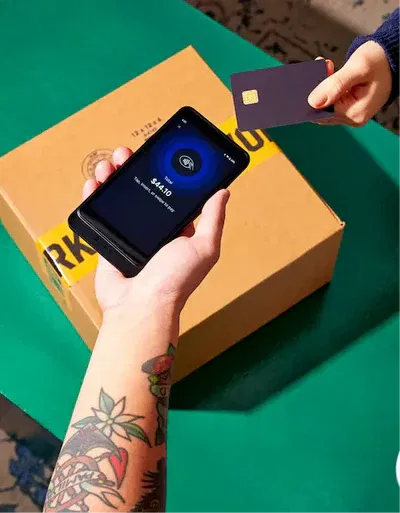
| Hero Image or Video | Visual cue that aligns with the offer; builds trust and human connection. |
| Value Proposition | Explains “What’s in it for me?” with benefits, not just features. |
| Call-to-Action (CTA) | Strong, visible, action-driven; use verbs like “Get,” “Download,” “Start.” |
| Trust Indicators | Includes testimonials, reviews, badges, media mentions, and guarantees. |
| Form | Short and frictionless; fewer fields increase conversion. |
| Urgency/Scarcity | Tactics like timers, limited spots, or deadlines to encourage fast action. |
| Responsiveness | Mobile-first design with fast loading across devices. |
| Above-the-Fold Strategy | Place CTA and key info before scrolling is needed. |
| No Navigation Menu | Removes distractions; keeps visitors focused on the conversion goal. |
| Color Psychology | Use of color to evoke emotion and highlight CTAs (e.g., green = go, red = alert). |
| A/B Testing | Test variations of copy, images, buttons, and layouts to improve performance. |
| Social Proof | Real-user feedback builds credibility and reduces buyer hesitation. |
| Emotional Triggers | Highlight transformation, address pain points, and use empathy-driven copy. |
| Landing Page Strategy | Align messaging with user source (e.g., Google Ads, email) and conversion goal. |
| Localized Design (Efficace) | Culturally relevant design and content for global audiences (e.g., GDPR compliance). |
What Makes a Good Landing Page? Let’s Break It Down
To really understand what makes a good landing page, we need to define its purpose: it’s a standalone web page created specifically for a marketing or advertising campaign. Unlike your homepage, it has one job—convert.
Here are the non-negotiable traits:
-
Clarity: No fluff, no filler.
-
Focus: One goal, one action.
-
Relevance: Speaks directly to your audience.
-
Trust: Social proof, guarantees, and transparency.
-
Design: Clean layout, responsive, fast.
In short, what makes a good landing page is a well-balanced combination of content, design, and user experience.
Key Components: What the Components of a Landing Page Should Include
Wondering what the components of a landing page are? Let’s map it out:
1. Headline That Hooks
You’ve got 3–5 seconds to keep them. Make it count.
2. Subheadline That Expands
This is where you elaborate the value briefly.
3. Visual Hero Section
Use images or videos that reinforce your message and humanize your offer.
4. Value Proposition
Highlight the benefits, not just features. Explain “What’s in it for me?”
5. Call-to-Action (CTA)
Clear. Bold. Repeated. Your CTA must be unmistakable.
6. Trust Indicators
Testimonials, reviews, logos, and security badges build confidence.
7. Form or Conversion Tool
Only ask for what you need. Fewer fields = higher conversions.
8. Urgency or Scarcity
Countdown timers, limited spots, or expiring bonuses can nudge the decision.
9. Responsive Design
Mobile traffic isn’t optional—your page must shine on all devices.
Here’s a quick table to summarize:
| Component | Purpose |
|---|---|
| Headline | Grab attention instantly |
| Subheadline | Reinforce interest |
| Hero Image/Video | Visual engagement |
| Value Proposition | Explain benefits |
| CTA Button | Drive action |
| Trust Indicators | Build credibility |
| Form | Collect information |
| Urgency | Push decision-making |
| Mobile Optimization | Improve accessibility |
Landing Page Best Practices: Real-World Tips That Work
To master what makes a good landing page, following landing page best practices is a must. Let’s explore the most actionable ones:
1. Above the Fold Focus
Keep key elements visible without scrolling—especially your CTA.
2. Eliminate Navigation
Yes, remove that nav bar. It distracts from your one goal.
3. Test Religiously
A/B test headlines, images, button colors—even emojis. Small tweaks = big gains.
4. Speed is King
Pages taking over 3 seconds to load lose 53% of mobile users.
5. Use Directional Cues
Arrows, gaze direction in photos, and animations guide users toward your CTA.
Landing Page Tips from the Trenches
I’ve written dozens of landing pages for clients across industries—from SaaS to supplements—and I can tell you this: sometimes what makes a good landing page is the result of surprisingly small decisions.
Here are a few hard-earned landing page tips:
-
Use action verbs in your CTA: “Get My Free Guide” works better than “Submit.”
-
Avoid vague copy like “Learn More.” Be specific. Be benefit-driven.
-
Use customer language—mirror the exact words your audience uses when talking about their problems.
-
Don’t bury your CTA at the bottom. Place it top, middle, and bottom.
Landing Page Design Best Practices: It’s Not Just Pretty, It’s Profitable
Function beats form—but you need both. Let’s look at landing page design best practices that reinforce what makes a good landing page:
Minimalist Layouts
Less clutter = more clarity. Use whitespace like a pro.
Color Psychology
Red = urgency. Blue = trust. Green = go. Choose wisely.
Button Contrast
Your CTA should stand out like a red umbrella in a sea of gray.
Font Choices
Readable fonts > fancy ones. Think legibility, not calligraphy.
Visual Hierarchy
Use size and color to draw the eye to your most important elements.
What Makes a Great Landing Page? Psychology + Copy + UX
So, beyond technical best practices, what makes a great landing page?
Great landing pages tap into human psychology. They:
-
Address pain points up front
-
Build empathy through storytelling
-
Show transformation (before vs. after)
-
Use social proof effectively
-
Reassure objections (“Cancel anytime,” “No credit card required”)
This trifecta—clear copy, emotional resonance, and smart UX—is the real secret to what makes a good landing page truly great.
Landing Page Strategy: From Concept to Conversion
Behind every successful landing page is a rock-solid landing page strategy. Let’s map it out:
1. Define One Goal
Is it lead gen? Sales? Webinar signups? Pick one.
2. Know Your Audience
Research pain points, objections, language patterns.
3. Map the Funnel
Where is your visitor coming from—Google Ads? Social? Email? Align messaging accordingly.
4. Offer a Bribe
Free eBooks, discounts, checklists—what’s your irresistible magnet?
5. Measure & Iterate
Track bounce rate, conversion rate, time on page, and heatmaps.
Bonus: Landing Page Efficace—A European Twist
For our multilingual friends, the term landing page efficace (French for “effective landing page”) is making waves in digital circles.
What makes a landing page efficace?
-
Clear headlines (in native language!)
-
Localized trust badges and payment options
-
Culturally aligned visuals
-
GDPR-compliant forms and privacy notes
If you’re targeting a global audience, remember: what makes a good landing page in the U.S. might differ slightly abroad.
Common Mistakes That Sabotage Conversions
Want to destroy your landing page faster than a toddler with a permanent marker? Here’s what not to do:
-
Too many links = distraction
-
Generic headlines = lost attention
-
Asking for too much info = drop-offs
-
Sluggish loading = high bounce rate
-
No mobile optimization = frustration
Fixing these alone can instantly elevate your landing page.
Case Study Snapshot: The 300% Conversion Boost
One of my clients—a fitness app—went from a 5% to 20% conversion rate just by:
-
Rewriting the headline to match ad copy
-
Adding before/after photos
-
Simplifying the CTA (“Get My Workout Plan”)
-
Removing exit routes (header links, footer)
That’s the magic of what makes a good landing page in action.
📌 Top 15 Frequently Asked Questions About What Makes a Good Landing Page
1. What makes a good landing page that converts visitors into customers?
A good landing page that converts is one that is laser-focused on a single goal, clearly communicates value, and makes taking action incredibly easy. So, what makes a good landing page stand out? It’s the fusion of persuasive copy, intuitive design, and psychological triggers.
Here’s what it typically includes:
-
A benefit-driven headline
-
A subheadline that adds clarity
-
One strong CTA
-
Social proof like testimonials or reviews
-
A clean, distraction-free layout
Conversion-focused landing pages follow landing page best practices like A/B testing, fast load times, and mobile optimization. The goal is to build trust, reduce friction, and make the next step obvious.
2. What are the most important components of a landing page?
Understanding what the components of a landing page are is key to building one that performs well. A landing page isn’t just a pretty layout—it’s a carefully crafted user journey. The essential components include:
-
Headline: Grabs attention.
-
Subheadline: Reinforces interest.
-
Hero Image or Video: Builds engagement.
-
Unique Selling Proposition (USP): Shows why your offer is better.
-
CTA Button: Prominently visible and clear.
-
Lead Capture Form: Simple and short.
-
Trust Signals: Testimonials, ratings, guarantees.
-
Urgency Elements: Countdown timers or limited offers.
-
Responsive Design: Optimized for all devices.
These pieces all work together to answer the visitor’s question: “Why should I take action now?”
3. How do landing page design best practices impact conversion rates?
Design isn’t just about aesthetics—it’s about function. Following landing page design best practices ensures users feel confident and can act without hesitation.
Here’s how good design helps:
-
Visual hierarchy draws attention to important elements like your CTA.
-
Whitespace helps reduce clutter, improving readability.
-
Contrasting colors highlight buttons and offers.
-
Responsive layouts ensure mobile users have a seamless experience.
When you implement smart landing page tips like using heat maps and A/B testing designs, you’ll discover exactly how design tweaks improve performance.
4. What makes a great landing page different from a good one?
So we know what makes a good landing page, but what makes it great?
The difference lies in how well you understand and serve your audience:
-
A great landing page mirrors the user’s search intent.
-
It uses the same language your target audience does.
-
It overcomes objections before users even raise them.
-
It evokes emotion while delivering value.
-
It includes elements of landing page strategy like persuasive storytelling and urgency.
In other words, a great landing page doesn’t just present an offer—it builds a connection.
5. Why is it important to eliminate navigation links on a landing page?
One of the most recommended landing page best practices is to remove all external navigation. Why?
Because distractions kill conversions.
When someone clicks your ad or email link, they’re curious. Don’t give them an escape route with a nav bar or footer full of links. Keep their attention where it belongs—on your call-to-action. This laser focus is part of what makes a good landing page effective.
6. How can I create a landing page efficace for a multilingual or European audience?
If you’re marketing to a European audience, consider building a landing page efficace (French for “effective landing page”). To do this, follow region-specific landing page design best practices, such as:
-
Localizing all content (language, currency, cultural references).
-
Using GDPR-compliant forms.
-
Including country-specific trust indicators (e.g., EU-certified badges).
-
Offering support in local languages.
What makes a good landing page globally is personalization—tailor your message to the audience’s expectations and norms.
7. How do I know if my landing page is working?
Metrics matter. To know whether what makes a good landing page is working in your case, monitor:
-
Conversion rate (visits vs. actions taken)
-
Bounce rate (how quickly users leave)
-
Time on page
-
Form submission rate
-
Heatmaps and click maps
These data points help guide your landing page strategy and validate whether your current design and copy choices align with your goals.
8. What role do testimonials play in landing page effectiveness?
Testimonials are one of the most powerful landing page components that build trust instantly. If you’re wondering what makes a good landing page more believable, it’s social proof.
Here’s why testimonials work:
-
They reduce uncertainty.
-
They answer unspoken questions.
-
They increase emotional confidence.
-
They validate your product’s success.
Using testimonials is not just a tip—it’s a cornerstone of all high-converting landing page tips.
9. Should I include video on my landing page?
Absolutely—if used strategically. Video content can significantly boost engagement and conversion. Here’s how it contributes to what makes a good landing page:
-
Increases time on page
-
Builds emotional connection faster
-
Demonstrates value clearly
-
Humanizes your brand
Use video in the hero section or as a testimonial. Just keep it short (under 90 seconds), with captions for silent autoplay.
10. How many CTAs should a good landing page include?
A great rule of thumb for landing page best practices is: one goal, one CTA.
That said, you can repeat the same CTA multiple times throughout the page (top, middle, and bottom), but avoid offering different actions. Confusion leads to friction.
What makes a good landing page is clarity. Repetition is fine—diversion is not.
11. How many form fields should my landing page include?
The fewer, the better. Studies show that reducing form fields from 11 to 4 can increase conversions by 120%. A good rule:
-
For lead gen: Name + Email.
-
For trials or purchases: Add only what’s essential.
This is part of landing page design best practices—streamline the experience.
12. What makes a good landing page headline?
Your headline is your first impression, so make it powerful. A great headline should:
-
Speak directly to a benefit
-
Reflect the user’s intent or search query
-
Use emotional or urgent language
-
Be short and punchy (under 10 words)
Think: “Double Your Email List in 30 Days” vs. “Welcome to Our Newsletter Service.” The former follows landing page best practices—the latter, not so much.
13. How often should I update or test my landing page?
If you’re serious about optimizing what makes a good landing page, continuous testing is non-negotiable. Here’s what to test:
-
Headlines
-
CTA button color and text
-
Hero image vs. video
-
Testimonials
-
Form field count
Run A/B tests at least monthly and track performance. Remember: ongoing testing is part of a successful landing page strategy.
14. What’s the ideal length of a landing page?
It depends on your audience and offer.
-
Short-form landing pages work well for free offers or low-friction actions (like email signups).
-
Long-form landing pages are better for high-ticket items, B2B products, or when addressing objections is crucial.
Ultimately, what makes a good landing page is not its length—but how well it communicates value and drives action.
15. Can I use the same landing page for ads and organic traffic?
Technically yes, but it’s not ideal. Here’s why:
-
Ad traffic is often colder and needs fast value delivery.
-
Organic users may come in warmer, wanting more info.
-
SEO-optimized pages include more text, internal links, and rich content.
If you want both to work, design two versions: one lean and fast for ads, and one content-rich for SEO. That’s a smart landing page strategy.
Conclusion: You Now Know What Makes a Good Landing Page
To wrap it all up:
-
What makes a good landing page is clarity, focus, and a seamless user journey.
-
Nail the headline, visuals, CTA, and trust signals.
-
Follow landing page best practices, avoid common mistakes, and always test.
Now that you know what makes a good landing page, it’s time to build one that converts like crazy.
👉 Want real examples or help crafting yours? Drop a comment, share your thoughts, or browse more landing page resources right here on the blog.
